 Section 508 of the Rehabilitation Act requires all electronic and information technology (EIT) developed, procured, maintained, or used by United States federal agencies to be as equally accessible to persons with disabilities as it is to those who are not disabled.
CATMEDIA ensures all graphic designs, web designs, videos, and animations – any products we create – meet the technical, functional, and support requirements to be legally compliant.
Designing infographics, web graphics, and marketing or sales collateral with visually-impaired people in mind is pertinent to a larger audience than highly inclusive designers and those seeking compliance with Section 508. Constructing content to be accessible for people with visual impairments also strengthens the user experience for the rest of your audience. Readability, contrasting elements, use of color, strong symbolism, and text/voice alternatives all make designs more impactful.
Section 508 of the Rehabilitation Act requires all electronic and information technology (EIT) developed, procured, maintained, or used by United States federal agencies to be as equally accessible to persons with disabilities as it is to those who are not disabled.
CATMEDIA ensures all graphic designs, web designs, videos, and animations – any products we create – meet the technical, functional, and support requirements to be legally compliant.
Designing infographics, web graphics, and marketing or sales collateral with visually-impaired people in mind is pertinent to a larger audience than highly inclusive designers and those seeking compliance with Section 508. Constructing content to be accessible for people with visual impairments also strengthens the user experience for the rest of your audience. Readability, contrasting elements, use of color, strong symbolism, and text/voice alternatives all make designs more impactful.
TYPES OF VISUAL IMPAIRMENT
Understanding the different types of visual impairments and how they might affect a user’s experience is a good place to start when designing 508 compliant products. It can be hard to envision what graphic design elements look like through eyes that aren’t your own. Fortunately, there are tools online that replicate visual impairments, which provide insight for designing solutions to accessibility issues. Below are descriptions and examples of a few types of visual impairments. In later sections of this article we will address design solutions for visual deficiencies. For each visual impairment, we show the familiar Google logo to illustrate how people with a particular impairment might see it.-
Color blindness
Normal Vision

Deuteranomaly – Reduced sensitivity to green light

Protanopia – Red-blindness

Tritanopia – Blue-blindness

-
Low acuity
Low Acuity Vision

-
Clouded/Obstructed
Glaucoma – Damaged optic nerve

Macular Degeneration – Loss in center field of vision

-
Complete blindness
READABILITY
Designs that are clear and consumable are the vehicle for delivering great content. Designing for people with visual impairments challenges you to create designs with even more clarity. A clear design begins with the appropriate typographical selections. A clean sans-serif typeface (meaning no extended features on the letters) such as Arial, Verdana, or Helvetica helps increase the legibility of your content. Text that is heavily stylized, such as a cursive typeface or an italic font, will make it more difficult to differentiate individual characters.
By making space in and around words, they become more distinguishable and enjoyable to read. Some visual adjustments to the text spacing that increase readability include:
A clear design begins with the appropriate typographical selections. A clean sans-serif typeface (meaning no extended features on the letters) such as Arial, Verdana, or Helvetica helps increase the legibility of your content. Text that is heavily stylized, such as a cursive typeface or an italic font, will make it more difficult to differentiate individual characters.
By making space in and around words, they become more distinguishable and enjoyable to read. Some visual adjustments to the text spacing that increase readability include:
- Tracking (the space between words)
- Kerning (the space between individual letters)
- Leading (the space between lines of text)
- Line width (most readable at 30-40 characters)
- Use bigger font sizes.
- No italics
- Bold when possible
- Use simple backgrounds.
- Avoid grey text and backgrounds.
- Avoid adding a shadow effect to text as it changes the shape of the letters.
CONTRASTING ELEMENTS
One of the best ways to improve the accessibility of your design is to use heavy contrast. Contrast can be applied to a variety of design elements, including color, size, and shape. To ensure there is enough distinction between visual components, there are a few techniques to assist you. One method I recom mend is checking the accessibility of your color choices. There are tools for this purpose such as the one Google built for their Material Design site. This tool determines the legibility of text in different colors and sizes alongside your
choice of background color. This is a great starting place to play around with initial color ideas. It’s also a great way to test out colors you have already chosen.
Other techniques for ensuring sufficient contrast include:
mend is checking the accessibility of your color choices. There are tools for this purpose such as the one Google built for their Material Design site. This tool determines the legibility of text in different colors and sizes alongside your
choice of background color. This is a great starting place to play around with initial color ideas. It’s also a great way to test out colors you have already chosen.
Other techniques for ensuring sufficient contrast include:
- Step back and squint at your design. Can you read/understand it?
- Switch the image to greyscale. Do the individual elements stand out?
- Use bolder, thicker lines. Lines that are too thin may not be seen at all.
DON’T RELY ON COLOR TO COMMUNICATE
It’s common for designers to lean on color to indicate meaning. Red is especially used as a crutch to say, “This is wrong.” Unfortunately, people who have trouble discerning reds may miss the message altogether. It’s much better to show an idea u sing a combination of symbolism, text, and color. This way, the message is delivered as strongly as possible to the largest amount of people.
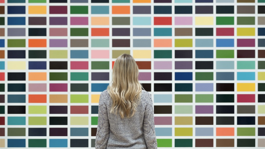
In the same way, charts and graphs that rely on color to separate groups can be hard to “read” for people with visual impairments, especially those with color blindness. By including contrasting textures and patterns you add another layer of readability. A strong design conveys the same meaning in monochrome. Think of color used in an accessible design like a coat of paint on a house. The structure and purpose of the house is the same with or without the paint.
sing a combination of symbolism, text, and color. This way, the message is delivered as strongly as possible to the largest amount of people.
In the same way, charts and graphs that rely on color to separate groups can be hard to “read” for people with visual impairments, especially those with color blindness. By including contrasting textures and patterns you add another layer of readability. A strong design conveys the same meaning in monochrome. Think of color used in an accessible design like a coat of paint on a house. The structure and purpose of the house is the same with or without the paint.
SCREEN READERS AND ALTERNATIVE TEXT
To ensure that a person using a screen reader is able to efficiently access your content, take the following measures:- Use a simple, single column layout.
- Any information that would be gathered from images, objects, scripts, CSS, etc. should be available via alternative text. Alternative text is a description inserted as an attribute on an image using HTML. A screen reader reads the alternative text in place of the image. Alternative text is visible to all users if an image fails to load.
- Strong alternate text is descriptive and contextually grounded. There is no need to include redundant information that can be gathered from the text surrounding an image. Keep the description concise, and put the important information first.
- The contents of a page should only change if an element is activated by the user.
- Accessible links and buttons are descriptive, not just text that reads, “CLICK HERE”. Explain what the link is and where it is going.
CONCLUSION
It’s best to keep your design as minimal as possible. Use a linear, organized layout with a strong hierarchy that is informed by the content. Avoid flashy or animated text and backgrounds that reduce readability. Select a small, thoughtful color palette that provides good contrast. Think about what you are trying to say and what needs to be included to get that point across. Thoughtfully editing and harnessing your designs to promote greater accessibility will make them more usable for everyone.
What are your design challenges when communicating to your target audience(s)? Please share below, and follow us on social media! Looking for other helpful tips? Check out our Resources page.
readability. Select a small, thoughtful color palette that provides good contrast. Think about what you are trying to say and what needs to be included to get that point across. Thoughtfully editing and harnessing your designs to promote greater accessibility will make them more usable for everyone.
What are your design challenges when communicating to your target audience(s)? Please share below, and follow us on social media! Looking for other helpful tips? Check out our Resources page.