Step 1: A Clear Goal
Every single successful data visualization begins with a question, a curiosity, followed by dedicated research. Data sets can be found in a large variety of places. Census tracts are useful and free resources that can benefit almost any topographic endeavor, especially those focused on discovering correlations between demographic, behavioral, and geographic data to learn more about the people which the data represents. There are scores of resources that maintain lists of usable information, some which are part of the open data movement, others that are only accessible for a fee. Another option for finding information, sometimes overlooked, is asking questions on forums, in blog comments, etc. The analyst should always use caution before beginning a project to ensure a reliable dataset.
Step 2: Cleaning
The next step, especially when constructing something to publish, is to clean the data. Capitalization should be consistent, spelling errors and extra spaces eradicated, and formatting developed with purpose. You may have 100,000 rows of data or more, so no time to waste!
We call this technique “data wrangling,” and there are many useful tools to help in this sort of effort. One such tool is an open source application called OpenRefine. OpenRefine allows the user to group the data using pieces of information, such as a string (a sequence of characters), a numeric value, or any other similarity that the data share. This is helpful for discovering typos, capitalization patterns, or other differences within a cell of data. This application can transform the data into other formats; combine it with other data sets, and more. OpenRefine fits most of CATMEDIA’s data wrangling needs. There are tools available for a fee that can help with other specific needs.
You may have 100,000 rows of data or more, so no time to waste!
We call this technique “data wrangling,” and there are many useful tools to help in this sort of effort. One such tool is an open source application called OpenRefine. OpenRefine allows the user to group the data using pieces of information, such as a string (a sequence of characters), a numeric value, or any other similarity that the data share. This is helpful for discovering typos, capitalization patterns, or other differences within a cell of data. This application can transform the data into other formats; combine it with other data sets, and more. OpenRefine fits most of CATMEDIA’s data wrangling needs. There are tools available for a fee that can help with other specific needs.
Step 3: Discovery
The next step in this method is to import the cleaned data into an applicable geographical data visualization software, and begin analysis. Today, there are many innovative mapping software projects and presentation tools to choose from, making it difficult to recommend just one. I’ll let you in a little secret. The most important part of creating a successful data visualization is uncovering a story, trend, or insight from the data using curiosity, ingenuity, and creativity. This part is fun and exciting, full of adventure, and unexpected surprises. Thoughtful experimentation will help guide this process and reveal insight from what was once a series of numbers.
There are tried and true methods for representing geographical data that were developed and implemented long before digital interactive mapping was a glimmer in a cartographer’s eyes. For the purposes of this blog, I have laid out a brief description of a few types of thematic mapping. Thematic maps are usually used as tools to present statistical data connected with geographical locations, as opposed to general maps, like atlases. Here are some of the most widely used types of thematic maps.
I’ll let you in a little secret. The most important part of creating a successful data visualization is uncovering a story, trend, or insight from the data using curiosity, ingenuity, and creativity. This part is fun and exciting, full of adventure, and unexpected surprises. Thoughtful experimentation will help guide this process and reveal insight from what was once a series of numbers.
There are tried and true methods for representing geographical data that were developed and implemented long before digital interactive mapping was a glimmer in a cartographer’s eyes. For the purposes of this blog, I have laid out a brief description of a few types of thematic mapping. Thematic maps are usually used as tools to present statistical data connected with geographical locations, as opposed to general maps, like atlases. Here are some of the most widely used types of thematic maps.
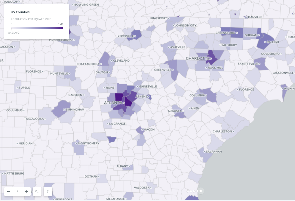
- Choropleth maps: use color to represent rates, quantities, values, etc. over a geographic range. Here, the linguistic stems are “choro,” meaning area, and “plethos,” meaning multitude.

- Dot maps: use markings of the same shape, size, etc. to represent a singular unit of data. Trends can be identified by determining patterns, or lack thereof, among the symbols.

- Graduated and proportional symbols: use markings of different sizes to represent different values. For example, a larger value might utilize a larger symbol.
 The deciding factor regarding which type of map to choose is which map will help the analyst to uncover and present the story of the data most clearly. On occasion when appropriate, maps can and should be layered atop one another.
Step 4: Visualization
The principles of design are important aspects of any data visualization. A distinct and meaningful visual hierarchy will illuminate the data. What is the most important part of the story being told or the insight being represented? We present the story with contrast; varying font sizes and style, the use of space, and color. These aspects can help demonstrate important themes such as conflict, transition, and density. Font and color choices along with the careful use of space will also help set the tone and purpose of the map. A map designed to be hung on a wall and look pretty may have an artsy script and many differing, yet cohesive colors. Maps created to inform may make use of a sans serif and a simpler color palette, so that the user may quickly digest and understand the information. There are many tools to help demonstrate the effects that color and typography have on a map, such as ColorBrewer and TypeBrewer. These are great resources to find inspiration from, but I caution you, they are just places to start. I always recommend experimenting with and adapting the colors and typographic elements of a map to meet specific needs of the project. Other more advanced visualization techniques involve elements that are inherent to interactivity. In the age of zooming in as close as you want to a map, enough to see an individual’s home, it is important to realize that the elements of the map need to scale as they become larger. A proportionate scale is not always appropriate. Code can be used to tell an interactive map when to leave out elements to conserve space, what size fonts and symbols should be at what zoom level, and how much detail to include in the background layer. This is important for the end user experience and ensuring your visual hierarchy is intact no matter how the user interacts with the map. Another exciting interactive mapping feature is including layers that the user can turn on and off. This helps a person disseminate the data. They can compare parts at a time, and draw conclusions at their own pace. While there are multitudes of considerations and important decisions to be made while selecting which presentation tools, methods, and techniques to use, the keys to good geographical data visualization are attention to detail, dedication, and creativity. Any good mapping software you choose can make a choropleth map, a dot map, etc. Only people can provide the personal insight and perspective it takes to turn a long list of numbers into an interesting and useful interactive map that is fit to share with the world. How do you use maps to tell your data stories?ABOUT CATMEDIA:
CATMEDIA is an award-winning Inc. 500 company based in Atlanta, Georgia. Founded in 1997, the company specializes in advertising, creative services, media production, program management, training, and human resource management. As a Women Owned Small Business (WOSB), CATMEDIA provides world-class customer service and innovative solutions to government and commercial clients. Current CATMEDIA clients include Centers for Disease Control and Prevention (CDC), Federal Aviation Administration (FAA), Office of Personnel Management (OPM), and the Department of Veterans Affairs (VA).Stay Connected with CATMEDIA: For more information, please visit CATMEDIA.com Like us on Facebook Follow us on Twitter